


4 Employers Share Architecture Portfolio Tips (With Real Examples)
We asked four Bespoke recruiters and a senior ARUP architect to review three real portfolios on camera. Here are the eight mistakes they found and how to fix them.


The 8 Basics of a Great Architecture Portfolio
1. Keep it to 8-15 pages, under 5MB
2. Open with a summary page listing your role and project stages
3. Put your best and most relevant work first, not chronologically
4. Always label whether work is student or professional
5. Show your process: plans, sections, sketches, models
6. List software skills in plain text, never as icons
7. Put your contact details on every single page
We asked four people who have collectively reviewed thousands of architecture portfolios to tear apart three real ones on camera. What follows are the eight lessons every architect needs to hear, direct from their review.
Bespoke Careers
Bespoke Careers
Bespoke Careers
UK, Middle East, India & Africa
Nail the Basics: Length and File Size
Before a hiring manager even opens your portfolio, two things can already work against you: a file that won’t download and a document that goes on forever. The panel were unanimous keep it tight, keep it small.
“Anything between 8 and 15 pages at an absolute max. It’s meant to be a snapshot of your best work.
Craig Murray
Architecture Consultant, Bespoke Careers
The rule applies to the file itself too. A bloated PDF signals carelessness before a single image has been seen.
“Nothing more than 10 megabytes, ideally 5mb because sometimes people have size limits on what they can receive via email.
Craig Murray
Architecture Consultant, Bespoke Careers
Quick checklist: before you send
✓ 8-15 pages maximum for an emailed portfolio
✓ Under 5MB ideally, absolute maximum 10MB
✓ Flatten your PDF as the very last step before sending
✓ Keep a longer, detailed version ready for interview
✓ Consistent page orientation portrait or landscape, never both
Pet hates from the panel
✗ Rotating from portrait to landscape mid-document (“That’s a red flag for me” – Craig)
✗ Sending a WeTransfer link. People are increasingly suspicious of external links
✗ Mixing A4 and A3 page sizes in the same document
Open With a Summary Page for Each Project
Every reviewer flagged the same frustration: beautiful imagery with no context. A strong portfolio opens by telling the reader who you are and what you’ve done on each project. The best candidates, the panel noted, solve this with a concise project summary page right at the front.
“What I find quite helpful is if there page at the front outlining their experience or their range of projects. The best people do it with just the name of the project, the RIBA stages they worked on, their role. Their role purely could be one sentence and that’s it. That’s all you need.
Craig Murray
Architecture Consultant, Bespoke Careers
What your summary page should include
✓ Project name and type
✓ Project phases or stages you worked on (e.g. concept, planning, delivery)
✓ Your specific role. One sentence is enough
✓ Project scale / budget if relevant
✓ Whether it’s student work or professional practice work
✓ Software skills listed in plain text (not icons)
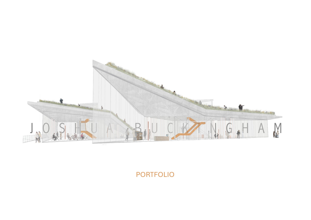
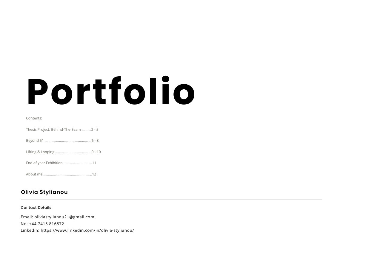
Left: Joshua opens with a visually stunning render. but no context, no role, no contact. Right: Olivia’s page 1 gives reviewers her project index and contact details before they’ve seen a single image.
Put Your Best Work First
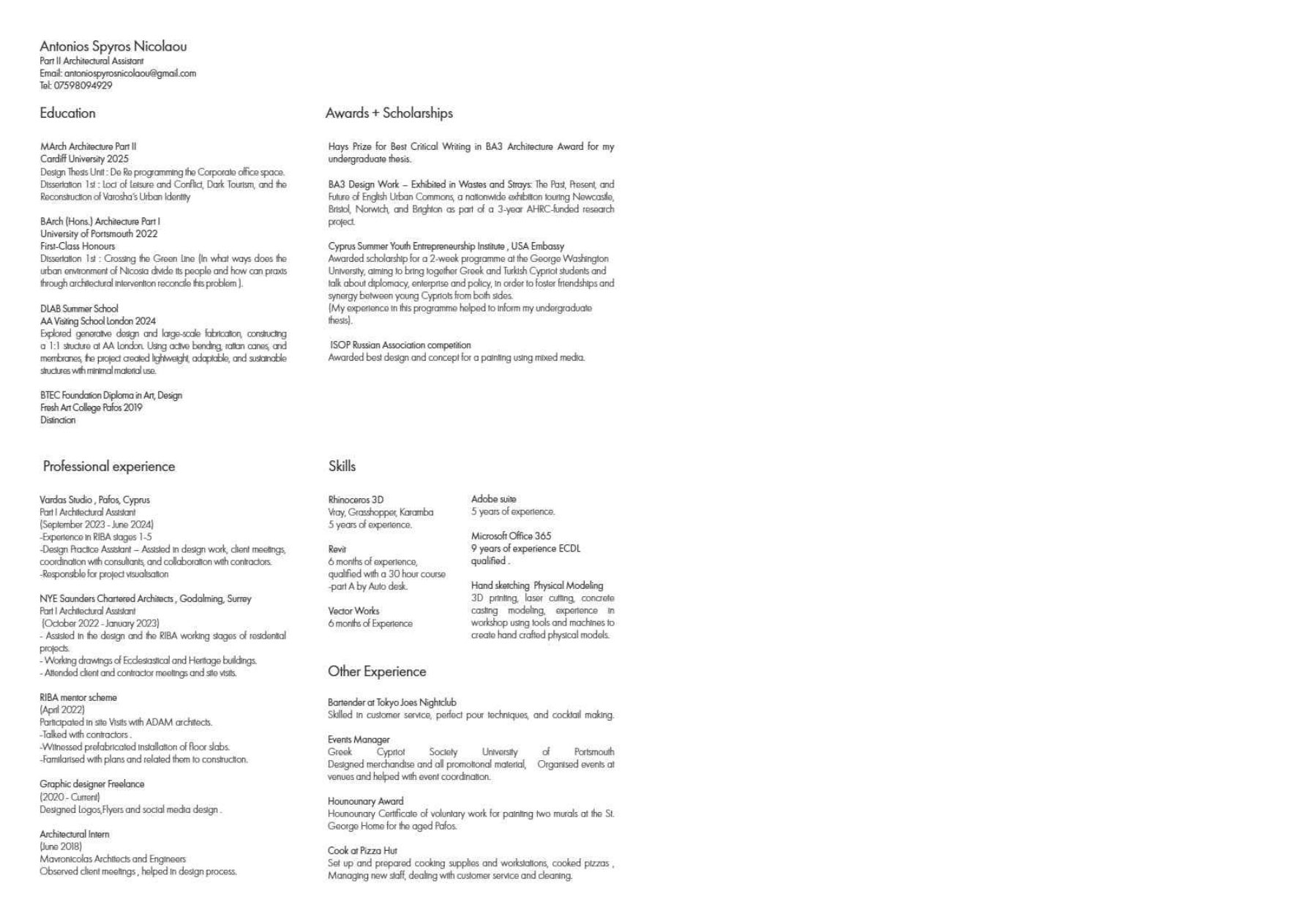
Time and again the panel found portfolios where the most compelling work was buried at the back. One candidate’s professional experience didn’t appear until page 28 of a 33-page document. By then, most hiring managers have already moved on.
“Good stuff first. Best bits at the front. Professional work should always take the lead.
Lucy Cahill
Director, Bespoke Careers
“People like list their work chronologically and put their best or latest works at the bottom. We sometimes review profiles and it’s not until we get to the end and we’ve almost dismissed them, and then suddenly you’re back in the conversation. A director would probably get three pages in and just go… no.
Craig Murray
Architecture Consultant, Bespoke Careers
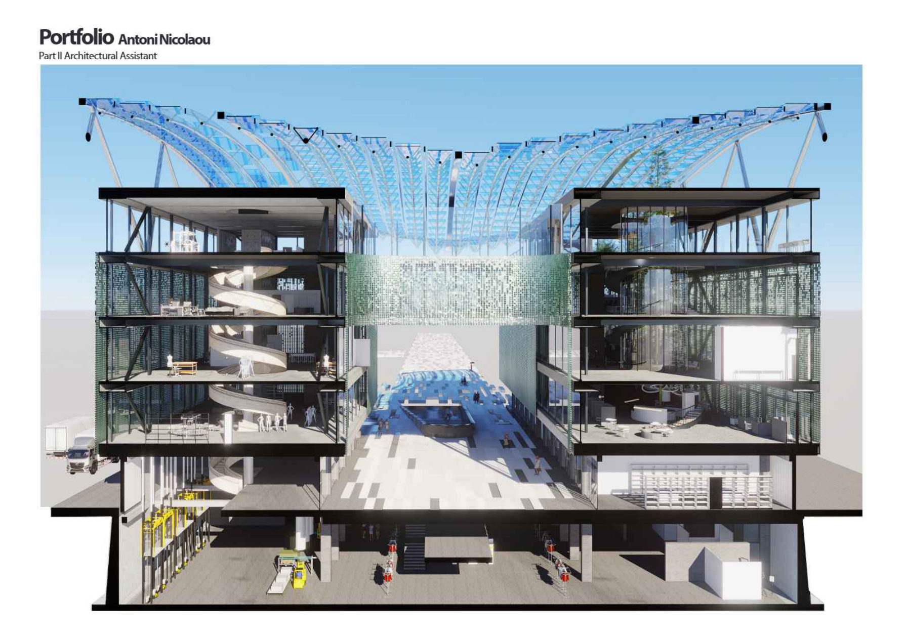
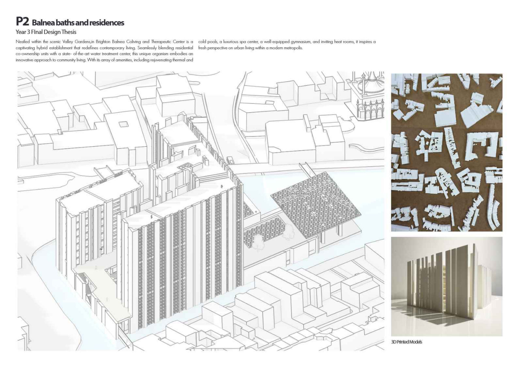
Antoni’s portfolio opens brilliantly, but his only professional practice work appears on page 28. Most hiring managers stop reviewing long before getting there.
Always Distinguish Student Work from Professional Work
This was one of the most repeated criticisms across all three portfolios. Without clear labelling, reviewers waste precious time trying to figure out whether a project was completed in university or on the job and that ambiguity can cost you.
“There’s nothing worse than an impressive image with no context of your role and how you’re involved in it. You could have been in a team of three people or a team of 30 people. Without that, you just don’t know.
Claudia Tschunko
Leader of ARUP Architecture, UK, Middle East, India & Africa
“Any hiring manager or studio director is going to want to see any experience you’ve got in practice. No matter big or small, you’re always going to want to see that over university work.
Craig Murray
Architecture Consultant, Bespoke Careers
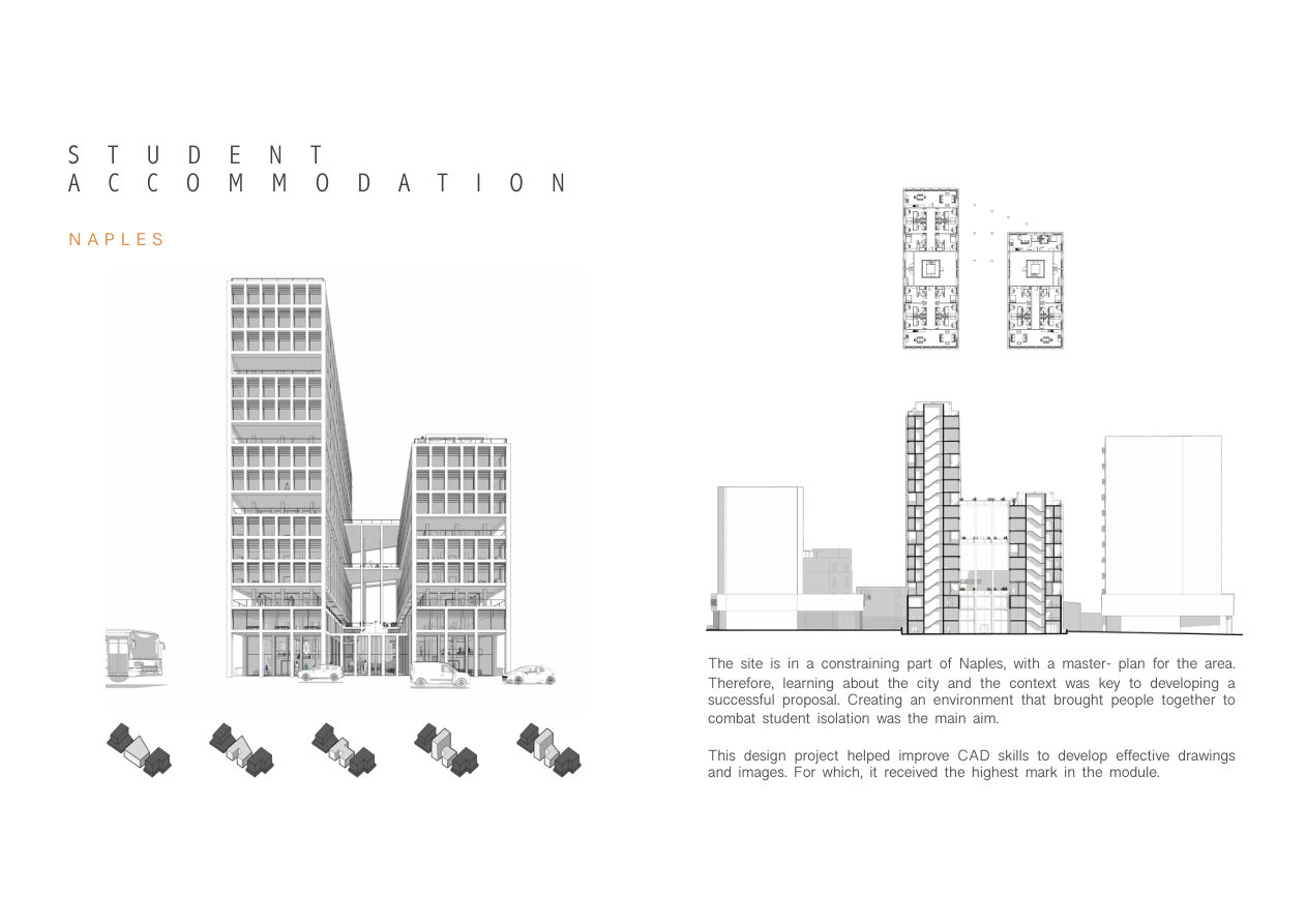
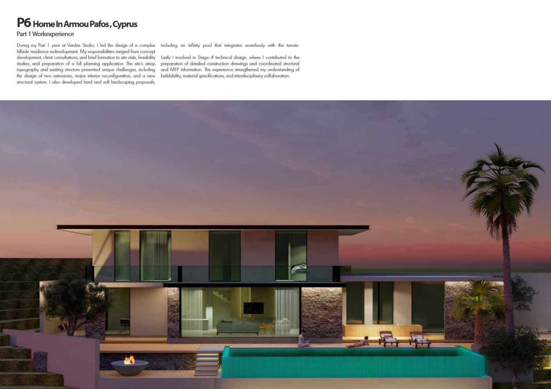
The project title says “Student Accommodation”. but is that the building type or a label for university work? One line of context eliminates the confusion instantly.
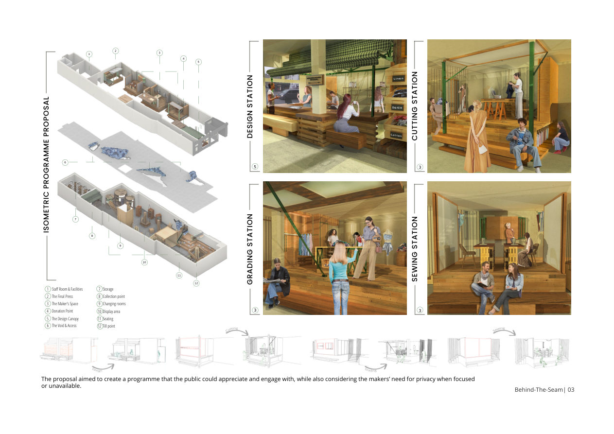
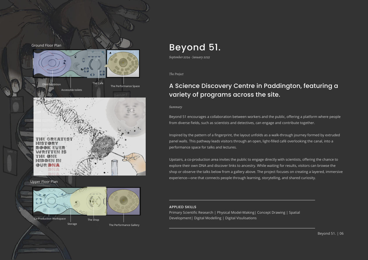
Show Your Process: Plans, Sketches, and Models
One of the strongest patterns the panel noted: portfolios full of polished 3D renders with no context. What separates a good portfolio is evidence of thinking how you got from problem to solution.
“When it’s too image-based, it’s quite easy to hide behind those images. Whereas if I have a site plan presented to me with a proper ground floor plan and I say to the candidate, “Explain the project to me how do you come in, what’s the sequence?” that’s how you sell something to a client team.
Claudia Tschunko
Leader of ARUP Architecture, UK, Middle East, India & Africa
“We quite like to see 2D plans and sections. Seeing a nice section or a nice plan is actually something that we find very impressive. And in the times of AI seeing hand sketches is really refreshing. It’s something that we always notice positively.
Claudia Tschunko
Leader of ARUP Architecture, UK, Middle East, India & Africa
Media the panel love to see
✓ Hand sketches and drawings
✓ Physical models (photographed well)
✓ 2D plans and sections alongside 3D renders
✓ Process images showing how you developed a concept
✓ Mixed media it signals a range of skills
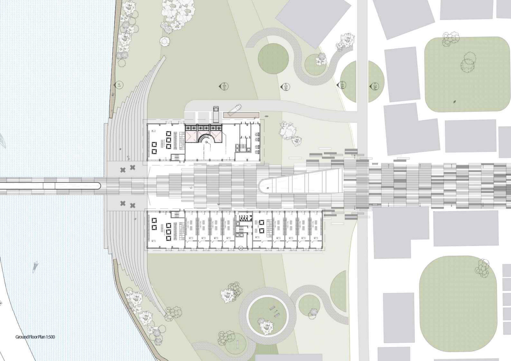
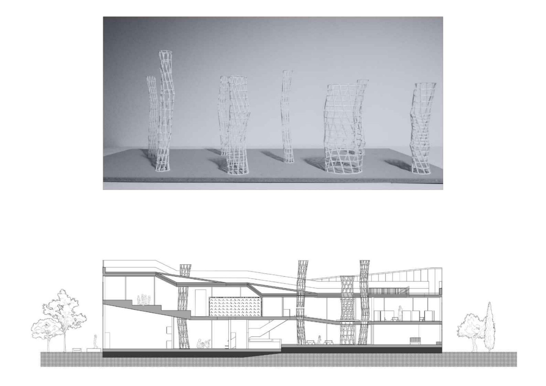
Pages from Antoni’s portfolio showing plans, physical models, and sections. The combination the panel praised as genuinely impressive, standing out against purely render-heavy portfolios.
List Your Software In Plain Text
Icons of Revit and AutoCAD logos look slick. But they’re invisible to Applicant Tracking Systems (ATS) the software most large firms use to scan CVs and portfolios before a human ever sees them. Write the names out.
“More and more people are using AI to filter through their applications. If it doesn’t pick it up, you’re going to miss out. It’s not going to pick up an icon. You need to write Revit.
Jimmy Bent
Managing Director, Bespoke Careers
Antoni listed software in plain text. the right instinct. However, the CV was exported as a rasterised image rather than selectable text, which still prevents ATS parsing. The lesson: text must be real text, not an image of text.
Put Your Contact Details on Every Single Page
Portfolios get printed, shared, forwarded, and split into separate pages. If your name and email only appear on the cover, you’ve lost your best advert the moment someone picks out a page they like.
“Put your phone number and email address on every page. If this gets printed on paper and it’s on someone’s desk, they’re not going to know who you are. The front page especially. You want your LinkedIn there too. We want to be able to see your profile instantly.
Lucy Cahill
Director, Bespoke Careers
Contact info on every page should include
✓ Full name
✓ Email address
✓ Phone number
✓ LinkedIn URL (clickable in the PDF)
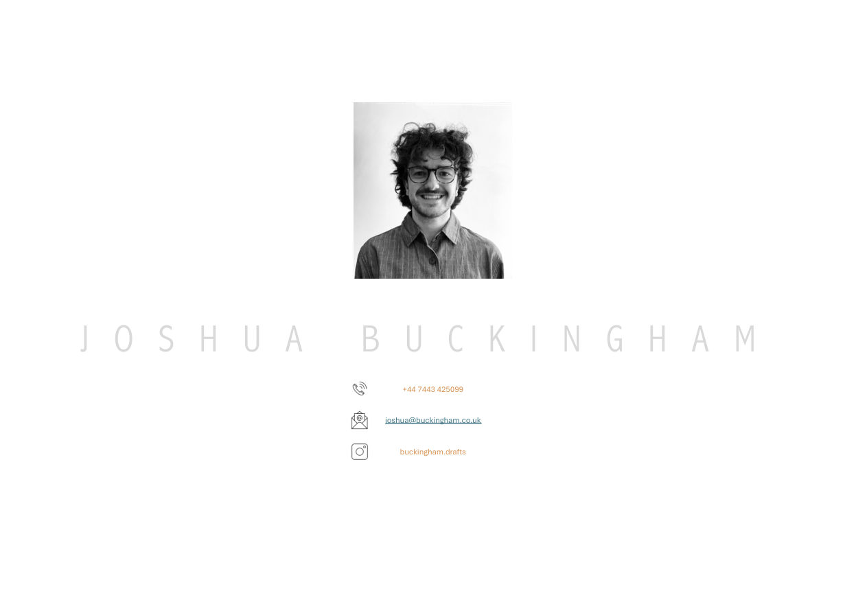
A hiring manager who prints one project spread from Joshua’s portfolio and passes it to a colleague has no idea who made it. Contact details on every page, in a small footer, takes five minutes to add and lasts forever.
Keep Layouts Clean, Consistent, and Accessible
Several of the reviewed portfolios were genuinely well-designed but undermined by tiny text, inconsistent backgrounds, and pages with no clear hierarchy. The panel stressed: employers spend 30 seconds on a portfolio before they decide whether to move on.
“We need to think about accessibility. I’m in my 40s, it’s can be harder to read and I don’t want to be zooming in. You want to capture people straight away.
Lucy Cahill
Director, Bespoke Careers
“A white background always presents stronger. When you switch from white to black, you’ve got a bit of a mix. It’s just better to stick to one preference would be white.
Craig Murray
Architecture Consultant, Bespoke Careers
Layout mistakes to avoid
✗ Tiny font sizes. If you need to zoom to read it, fix it
✗ Switching background colour between pages
✗ No clear visual hierarchy. Readers shouldn’t have to decide where to look first
✗ Too many images on a single page. One project per page is ideal
The Three Portfolios Reviewed: What the Panel Said
10-15 Years’ Experience: What Changes at Senior Level
The fundamentals don’t change much but what hiring managers are looking for shifts significantly once you have a decade of experience behind you.
“At that level, seeing the whites in someone’s eyes and understanding who they are is becoming even more important. Experience and the way of leadership, how they shape up in a room that’s as important as their work in a way.
Claudia Tschunko
Leader of ARUP Architecture, UK, Middle East, India & Africa
“Highlight the projects where you had the most involvement. If you’re just on it for two weeks, you don’t probably need to include it if you’ve got ten years of experience. You want to highlight your strengths whether you led packages, whether you were on site, whether you were client facing.
Craig Murray
Architecture Consultant, Bespoke Careers
What to include at senior level
✓ Number of people managed and team leadership experience
✓ Project wins and client-facing responsibilities
✓ Completed project photography shows quality through to delivery
✓ Tailor the portfolio specifically to the role you’re applying for
✓ Specific packages or deliverables you owned even the toilet package counts
✓ Finance, HR, or wider management contributions if relevant
“What is really quite attractive is when people come in and have a real proactive attitude towards our practice know about our practice well and can demonstrate and articulate a clear vision of what they want to do and the value they can bring. That is as compelling as their work.
Claudia Tschunko
Leader of ARUP Architecture, UK, Middle East, India & Africa
The length rule still applies. A portfolio can be 12 pages long even with 20 years of experience. The difference is that at interview, senior candidates can bring a comprehensive second portfolio and when asked “what do you want to see?”, navigate straight to the most relevant pages.
Architecture Portfolio FAQs: Answered by the Panel
How many pages should an architecture portfolio be?
8 to 15 pages for an emailed or submitted portfolio. That is the panel’s unanimous answer. The absolute maximum is 15 pages. Keep a longer, more detailed version of 20-30 pages specifically for in-person interviews where you can talk through every project. Anything beyond 15 pages for an application signals that you haven’t edited your own work.
What should be on the first page of an architecture portfolio?
Your cover page should show your name, a strong hero image, and your contact details (email, phone, LinkedIn). Immediately following the cover. as page 2. should be a project summary page: a clean list of your key projects noting the project name, the project stages you were involved in, your specific role in one sentence, and whether each is student or professional work. The best candidates do this concisely, not exhaustively.
Should I list software skills as icons or plain text?
Always plain text, never icons. Applicant Tracking Systems (ATS) used by most large architecture firms to screen applications cannot read image-based icons. A Revit logo means nothing to an ATS; the word “Revit” is searchable and will pass through screening. Write every software name in full: Revit, AutoCAD, Rhino 3D, Adobe InDesign, SketchUp, and so on.
What file size should an architecture portfolio PDF be?
Target under 5MB for any portfolio you’re emailing or submitting digitally. The absolute ceiling is 10MB. above that, many corporate email servers will block delivery entirely and you’ll never know. Flatten your PDF as the very last step before saving to dramatically reduce file size without sacrificing visual quality.
Should I include student work in my architecture portfolio?
Yes, but label it clearly and put professional work first. Any professional practice experience, however brief or junior, should appear before your university projects. Hiring managers are always more interested in professional work. If all your work is student-based, label each project clearly as university work and focus on showing the variety of your skills, media types, and thinking.
What process work should I include in an architecture portfolio?
The panel specifically praised: hand sketches and drawings, physical models (well photographed), 2D plans and sections alongside 3D renders, and images showing how a concept developed from early thinking to final design. In an era when AI can generate photorealistic renders in seconds, evidence of your thinking process. especially hand drawing and model-making. is a genuine differentiator.
How do I create a strong architecture portfolio layout?
Use a consistent white background throughout. Aim for one project per spread or page. Overcrowding reduces impact. Use readable font sizes: if someone needs to zoom in to read text, it needs to be larger. Put your contact details (name, email, phone number, LinkedIn URL) on every single page as a small footer. Keep consistent page orientation. Never mix portrait and landscape pages in the same document.
How is a senior architecture portfolio different from a junior one?
At 10+ years’ experience the emphasis shifts from demonstrating technical ability to demonstrating leadership, decision-making, and client impact. Highlight the projects where you had the most involvement and ownership. Show completed project photography. evidence that work reached delivery. Include team sizes managed, client-facing responsibilities, and packages you owned. Tailor the portfolio specifically to each role you apply for rather than sending a generic document.
Want Your Portfolio Reviewed on Camera?
Upload your portfolio and we’ll consider it for our next live panel review series. Real feedback from real recruiters and hiring managers, recorded and shared so every architect can learn.
Search for architecture and design jobs here
Latest architecture and design jobs around the world

Looking to hire top talent
 or advance your career? Let's talk.

We connect exceptional firms with talented professionals.
Let’s discuss how we can help you achieve your goals. Get in touch with the team today.
Related Posts


ADNZ Resene Architectural Design Awards National Gala Dinner 2026
Annual national gala celebrating New Zealand architectural design, with 2026 national and supreme award winners announced in Auckland.
The Bartlett Ball 2025
Celebrate architectural creativity and innovation at The Bartlett Ball 2025, showcasing student work and fostering networking.
Royal Academy Summer Exhibition 2026
The world’s longest-running open submission exhibition returns to Burlington House, with architecture forming a central strand of the summer programme.